
Volop Extra Voordelen
I redesigned Volop Extra Voordelen so the same stickers, pages, and campaign assets could run for both brands.
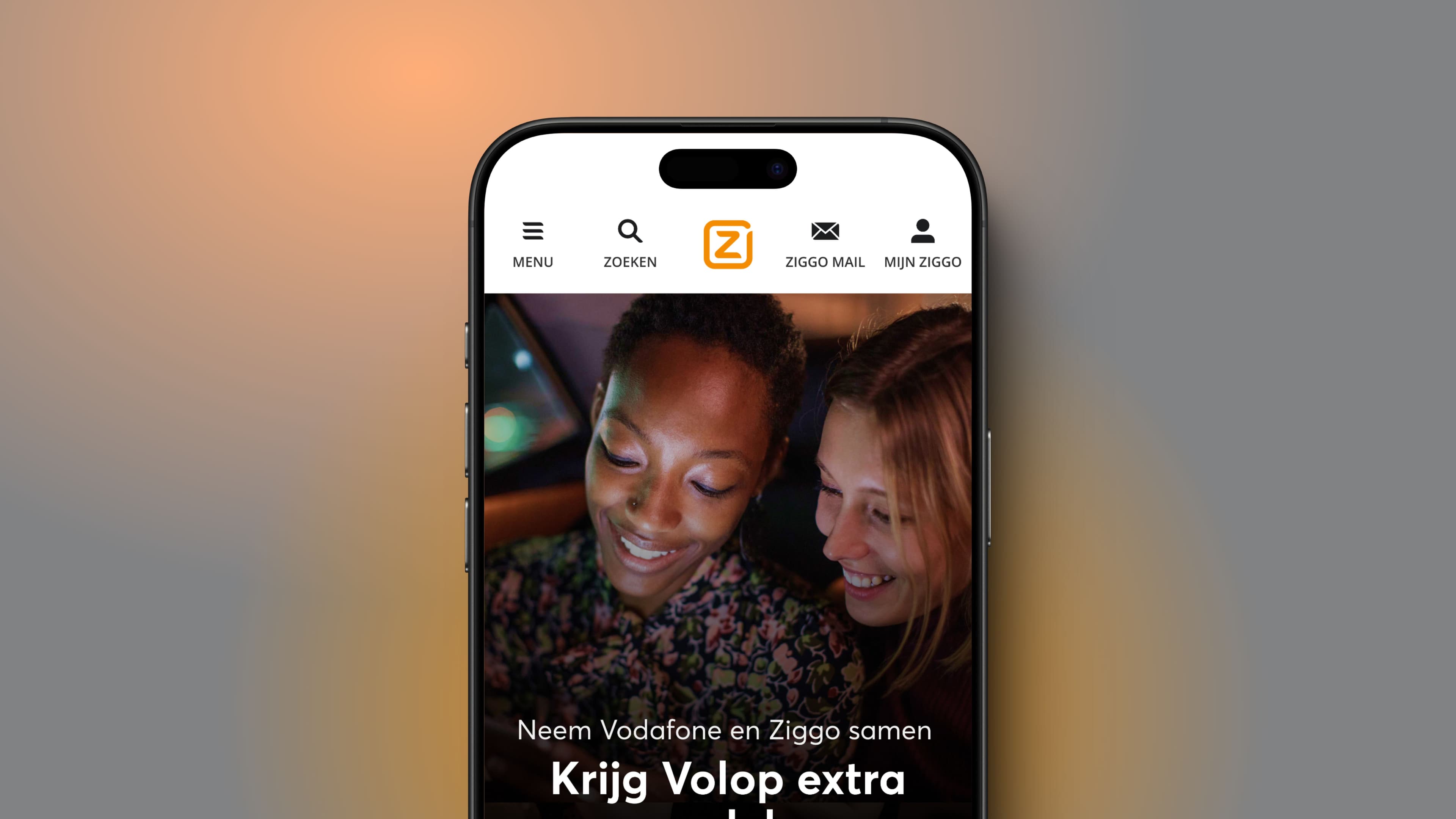
Show the payoff of combining Vodafone and Ziggo at a glance.
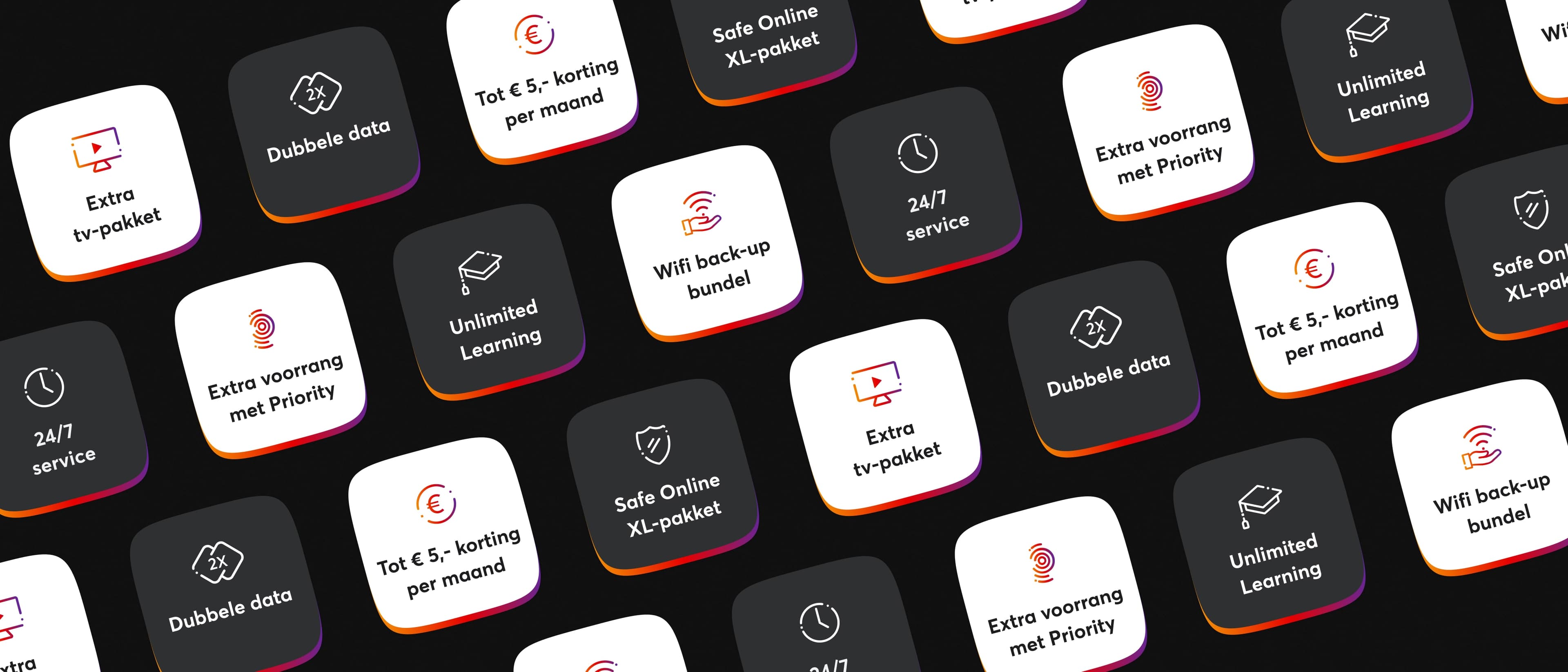
Volop Extra Voordelen rewards customers who combine Vodafone and Ziggo services with benefits such as double data and discounts. As the programme grew, the old visual language stopped explaining that offer, and it stopped looking like one programme.
- Situation
- A growing joint benefits programme had outgrown its visual language.
- My focus
- Unite two brands in one system that could hold across customer touchpoints.
- Result
- A refreshed identity and reusable assets for digital and print campaigns.
Methods
- Visual identity
- UX/UI design
- Art direction
- Campaign design
Create one flexible identity from two established brands.
The programme needed to feel current and easy to read while still belonging to Vodafone and Ziggo. The system also had to work on landing pages, benefit pages, banners, email, posters, and mobile formats without falling apart.
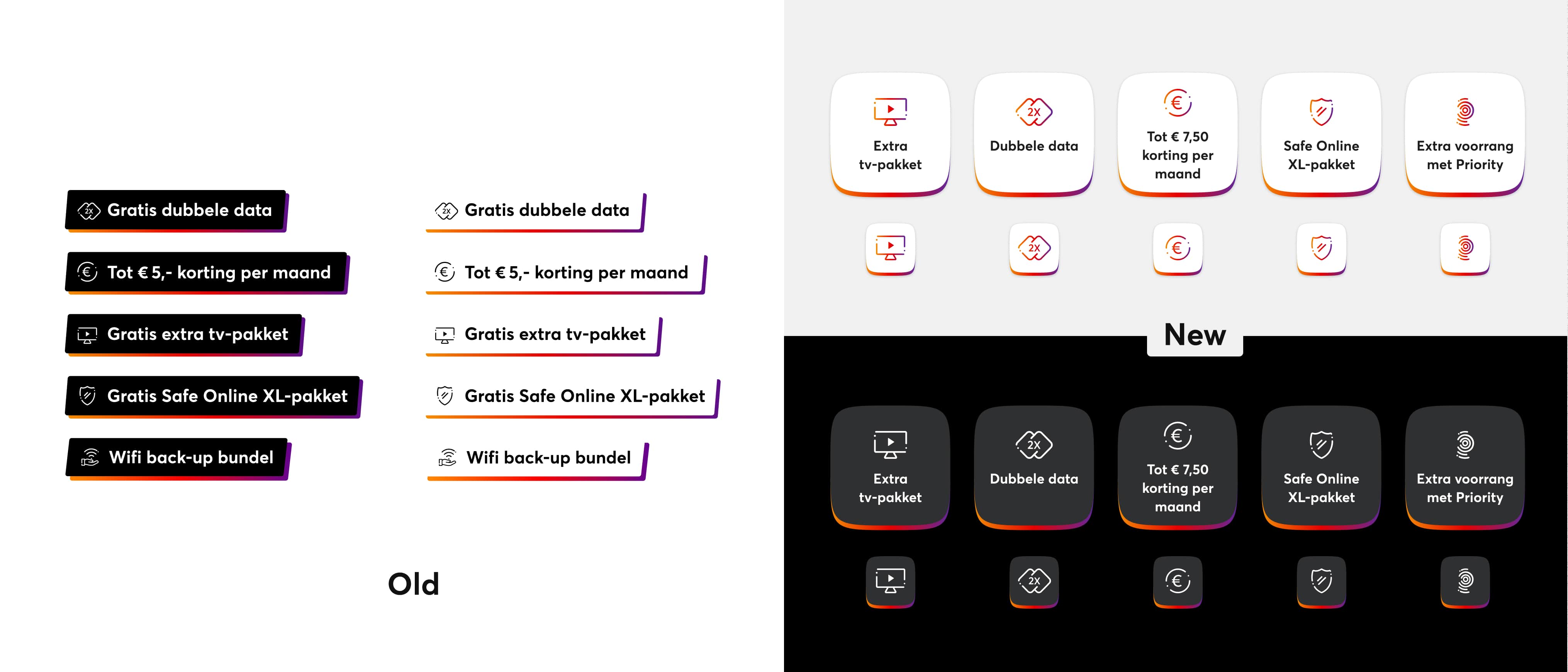
Balance two brands
Respect both visual languages without letting either one dominate.
Clarify each benefit
Help customers understand the offer at a glance.
Work everywhere
Create assets that adapt from mobile screens to printed campaigns.
One programme had to feel like Vodafone and like Ziggo, wherever a customer met it.
From identity design to the full customer-facing rollout.
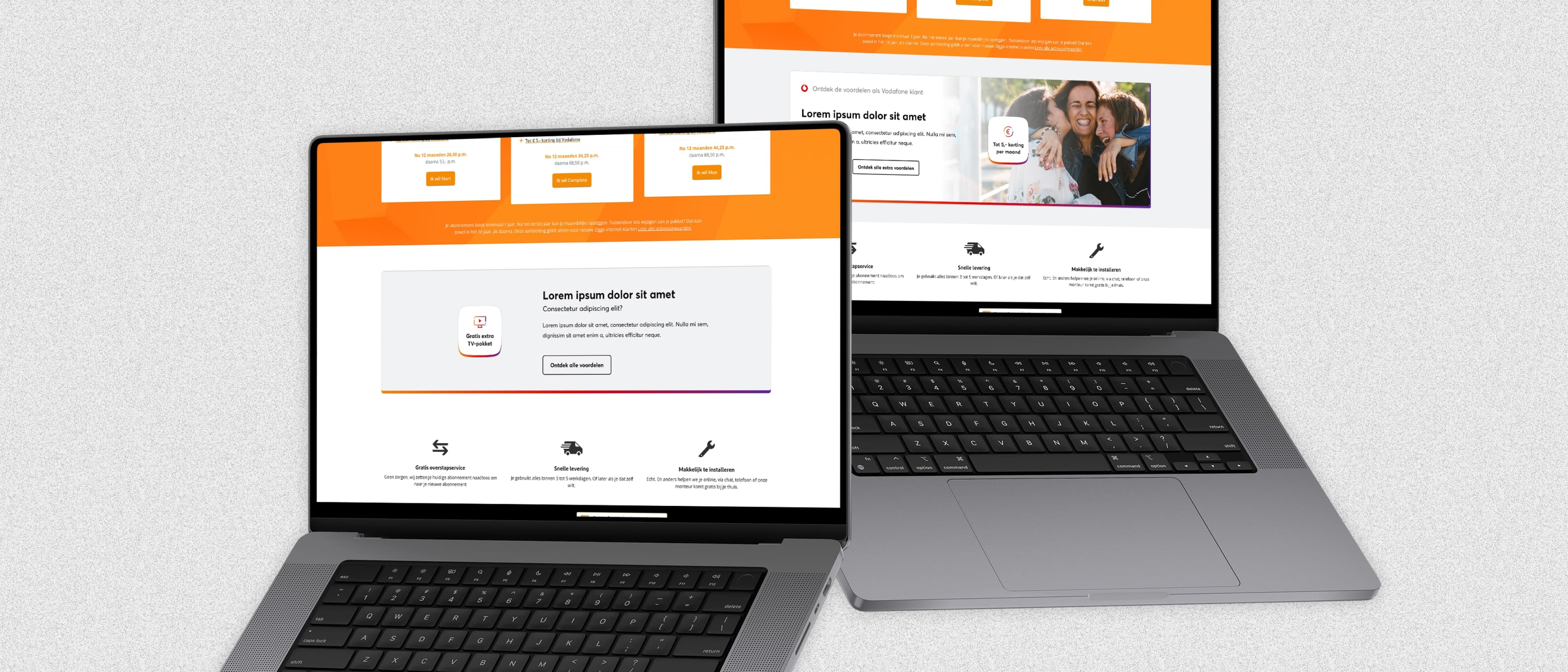
I redesigned the programme's visual identity, including the logo, colour system, icons, and layouts. I redesigned the landing page and benefit pages, worked with a photographer on the supporting imagery, and made the online and offline campaign assets.
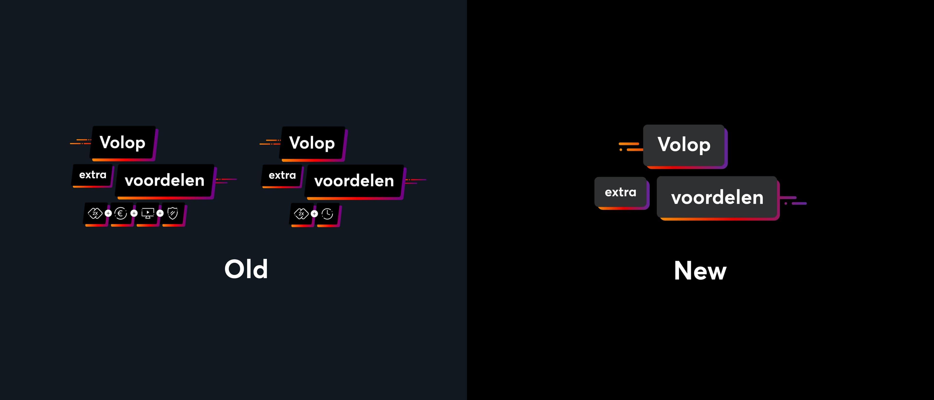
Reframe
Replace dated panels with a more flexible visual device.
Balance
Bring Vodafone and Ziggo together through colour, type, and layout.
Redesign
Refresh the landing page and the individual benefit pages.
Scale
Prepare reusable assets for online and offline campaigns.
Stickers, pages, and campaigns that could move without a redesign.
The work left a refreshed identity and a toolkit built around adaptable benefit stickers. The programme could show up the same way on web, mobile, email, banners, and print, with a clearer structure for explaining each benefit.
Project outcomes
- 2 brands
- brought together in one programme identity
- Digital + print
- one visual system for both
- Reusable
- benefit stickers and campaign assets
Next case