Building the customer loyalty platform of the biggest internet providers in the Netherlands.
Summary
Intro
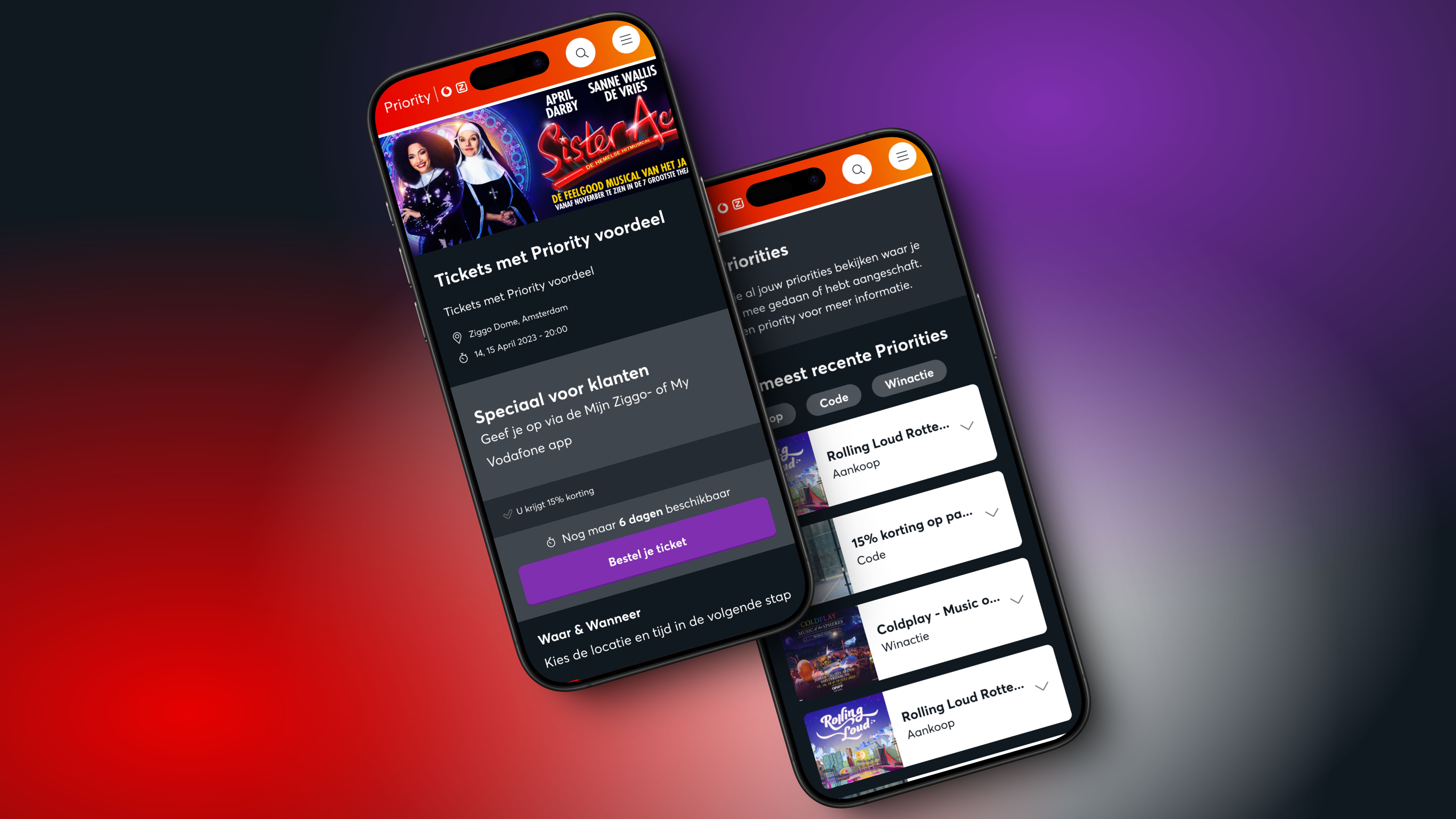
In the competitive telecom industry, keeping customers loyal is crucial. Vodafone and Ziggo aimed to build a platform that would not only reward their customers but also become a part of their daily digital habits. They envisioned a system where users could regularly find new offers and benefits, making them more likely to stay with the service.
Challenge
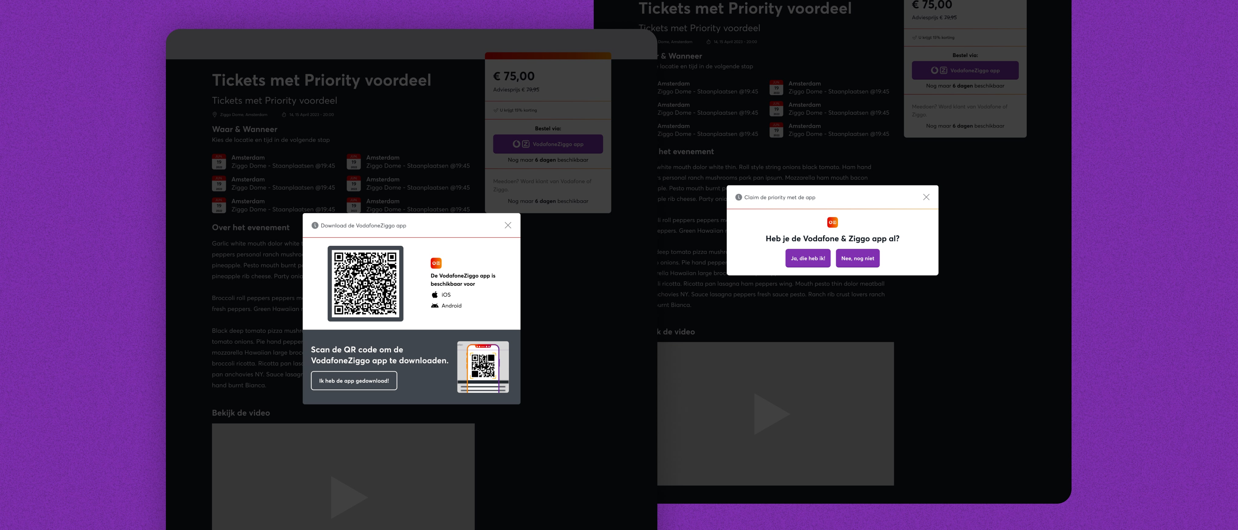
The big challenge was to build a platform that would really change the way Vodafone and Ziggo reward their customers. It had to offer great deals, like daily discounts and early access to events, but also encourage people to come back and use the app more often. The platform needed to work smoothly on both web and mobile, without feeling complicated or clunky.
What made it tricky was figuring out how to make the platform a regular part of people’s lives. We had to really understand what would keep users interested, what kind of rewards they cared about, and how to design something that felt worth checking every day.

My Role
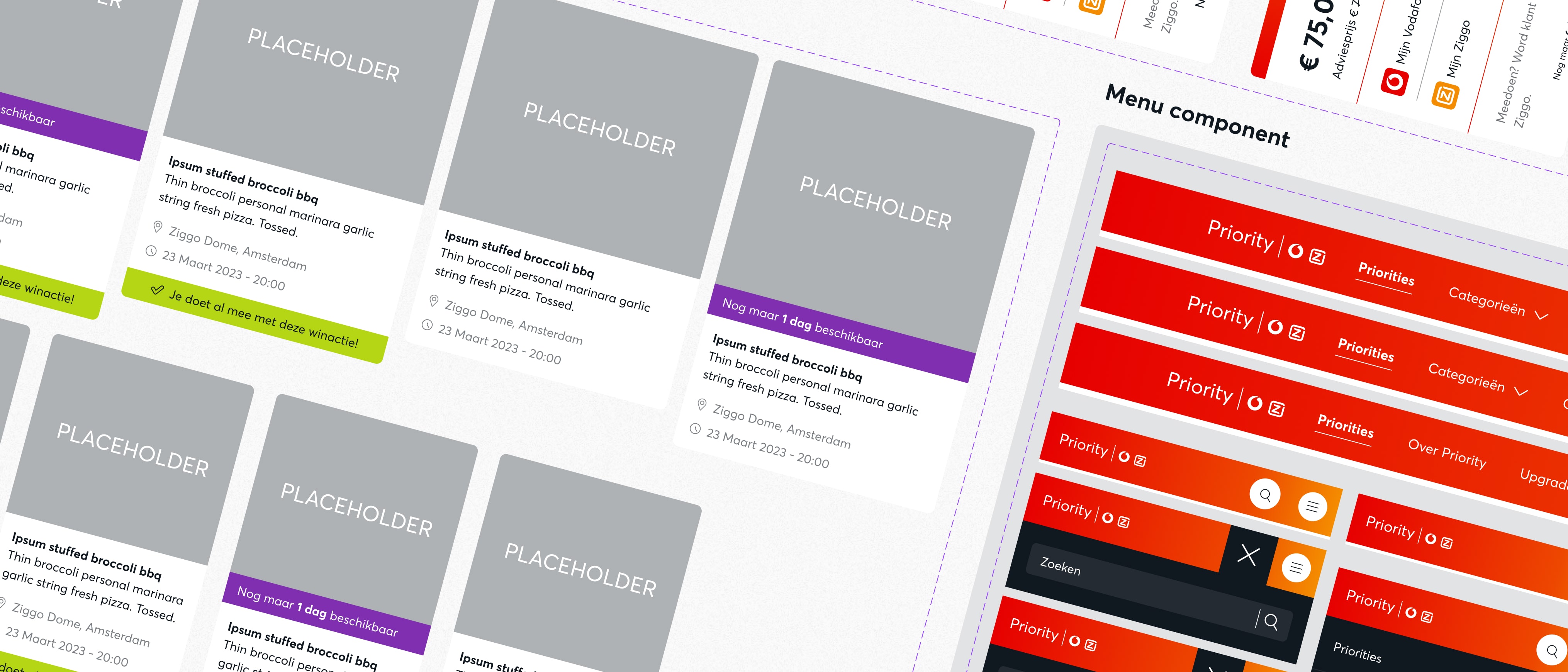
As the lead digital designer, I was responsible for creating a consistent and efficient design system. This included designing user-friendly interfaces and ensuring that the platform was accessible to everyone, regardless of how they accessed it. My work focused on making the user journey is intuitive and enjoyable, bridging the gap between web and app experiences.

Approach
We adopted a data-driven approach to understand user behavior and preferences. By analyzing key metrics and conducting user research, we identified areas for improvement. Collaborating with conversion rate optimization specialists, we established four guiding principles: Attract, Engage, Delight, and Grow. These principles guided our strategy and design decisions.
Our design process was iterative, meaning we continuously refined our ideas based on feedback and new information. Regular presentations to stakeholders ensured that everyone was aligned, and we could adapt quickly to changing needs. Accessibility was a key focus, ensuring that the platform was usable by all customers.
Conclusion
The Priority Platform is a great example of what can happen when teams work closely together and keep users at the heart of the design. Even as the project keeps growing, I continue to play a key role in making sure the design stays user-friendly and meets both business and customer needs.
Working on this platform has taught me a lot. It's shown me how important it is to stay flexible, use data to guide decisions, and design with everyone in mind. It’s still a work in progress, but that’s what makes it exciting, there’s always room to make things better. I’m proud of what we’ve built so far, and the experience has helped me grow a lot as a designer.